
Rate the Signature Above You
Fun and Games is a fun and zany place, but please remember to follow forum rules when posting. Things can become spammy, but please refrain from posting outright spam topics. Just ask a staff member if you have any questions!
Re: Rate the Signature Above You
![]() by Eli_Ayase » July 7th, 2011, 9:38 pm
by Eli_Ayase » July 7th, 2011, 9:38 pm
10/10 I love that movie and the effects in it
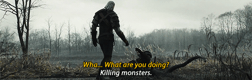
Evil is evil. Lesser, greater, middling, makes no difference. The degree is arbitrary. The definition’s blurred. If I am to choose between one evil and another, I rather not choose at all. – Geralt of Rivia
[Facebook] | [DeviantART] | [FictionPress.com] | [FanFiction.net] | [My Tumblr.]
I come and go, don't question me.
Also I'm an weeaboo/otaku, fite me m8 1v1 irl.
If you find anything offensive of what I say. Then it's not my fault that you took it serious.
-
Eli_Ayase
Gwynbleidd


Geralt of Rivia
- Posts: 16653
- Joined: March 25th, 2010, 7:25 pm
- Location: Iorveth's Forest (United Kingdom, Cambridgeshire area)
- Nickname(s): Eli, Ann, Nat, Elichika, Eri, Ayase, Elise
- Gender: Female
- Pride Points: 138
Re: Rate the Signature Above You
![]() by Jiirani » July 7th, 2011, 9:59 pm
by Jiirani » July 7th, 2011, 9:59 pm
8/10 I like it, but I feel like Simba should be facing the other direction [The overlayed/Transparent one] because he's looking outside of the signature and it sort of pulls the viewers eyes away from the focal point, or like the signature itself, because if he was facing the other way it would be a lot less distracting and we'd focus more on the center of the image.[Maybe that's just me, lol]

-
Jiirani
Hopeless Wanderer

Restoring light to the lighthouse
- Posts: 4031
- Joined: December 9th, 2010, 8:13 pm
- Location: Scotland
- Nickname(s): Eli, Jii, Lion
- Pride Points: 62
-
Tabby
Back from the ashes

- Posts: 5360
- Joined: May 9th, 2011, 3:50 pm
- Location: Somewhere over the rainbow
- Nickname(s): Deess, LxL, Jose, Bean, Burrito
- Gender: Male
- Pride Points: 103
-
Ultra Fox
lyING kInG!!!

woRSt MoVIE!!!!!!!!!!!!! >:(
- Posts: 6820
- Joined: May 23rd, 2011, 1:19 am
- Nickname(s): meem machine >;)
- Pride Points: 97

-
Daenerys
♛ queen ♛
nightmare dressed like a daydream
- Posts: 12786
- Joined: February 16th, 2011, 6:11 am
- Nickname(s): rena/dashie/whatever
- Gender: Female
- Pride Points: 175
Re: Rate the Signature Above You
![]() by Tabby » July 9th, 2011, 3:56 am
by Tabby » July 9th, 2011, 3:56 am
Gettin old x], but 8.5/10 I loveit :b

Victory, at last!
-
Tabby
Back from the ashes
- Posts: 5360
- Joined: May 9th, 2011, 3:50 pm
- Location: Somewhere over the rainbow
- Nickname(s): Deess, LxL, Jose, Bean, Burrito
- Gender: Male
- Pride Points: 103
Who is online
Users browsing this forum: No registered users and 364 guests
- The team • Delete all board cookies • All times are UTC [ DST ]