
The Coloration... what happened?!
6 posts
• Page 1 of 1
The Coloration... what happened?!
![]() by Misiziri » December 27th, 2010, 7:16 pm
by Misiziri » December 27th, 2010, 7:16 pm
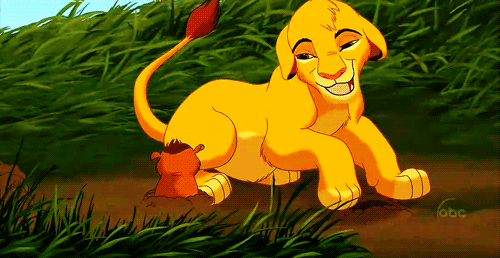
If you compare the colors of TLK1 to SP, you can see a huge difference. TLK's colors are vibrant and eye-catching, whil SP's are dull and have an earthy tone. Look up at the picture at the top of the page, with the main characters wearing X-mas hats. Look at how dull Kiara and Kovu look compared to Nala. Also, Simba is... orange in SP! I know the film budget was low, but really what was up with the coloration?
-
Misiziri

- Posts: 16526
- Joined: December 27th, 2010, 4:58 pm
- Nickname(s): La'Vie
- Gender: Female
- Pride Points: 168
Re: The Coloration... what happened?!
![]() by atouchofgrace » December 27th, 2010, 7:32 pm
by atouchofgrace » December 27th, 2010, 7:32 pm
Low budget and tv crew (SP was produced by Walt Disney Television Animation, same people who made Timon & Pumbaa, the Aladdin series and sequels, etc...). We're talking about much less talented animators, producers, directors... Disney doesn't care about sequels. They're good to make a few bucks and milk the nostalgia cow. Sorry if I'm being harsh but it's the reality.


-
atouchofgrace

- Posts: 1681
- Joined: November 13th, 2010, 11:00 pm
- Nickname(s): Cat
- Gender: Female
- Pride Points: 2
Re: The Coloration... what happened?!
![]() by Misiziri » December 27th, 2010, 7:34 pm
by Misiziri » December 27th, 2010, 7:34 pm
Yeah... I wish it could be different  This could've had the potential to be not only an excellent sequel but a great movie on its own. *sigh* At least the actors were decent and the songs were great!
This could've had the potential to be not only an excellent sequel but a great movie on its own. *sigh* At least the actors were decent and the songs were great!-
Misiziri
- Posts: 16526
- Joined: December 27th, 2010, 4:58 pm
- Nickname(s): La'Vie
- Gender: Female
- Pride Points: 168
Re: The Coloration... what happened?!
![]() by Panda-chan » December 27th, 2010, 7:43 pm
by Panda-chan » December 27th, 2010, 7:43 pm
That > viewtopic.php?f=76&t=2551
D̵̢̨̧̛͔̖͍̝̤̫̼̝̬̤̪̟͇͙̊̏̎͛̇̏͊͌̃̂̈́͂̒̄̅̚̚͘͝R̸̥̙͂̀̾̑̊̀̉́̀́̐̄̊̿̈́̄͑̐̕͝I̴̗̯̼̳͉͕̺̤̖̝̪̫̊͛͝͠Ǹ̵̨̧͈̮̦̖̝͈̥̗͕̭͉̺̲͕̥͔͎̹͖͙͇̲̘̩̞͓̦̦̯̮̙̜̼̝͈̣̺̰̺̟̙̫̫ͅK̶̢̢̡̧̢̛̻͎̘͉̦͚̳̗̱̗̮̫̲͎̟͚͖̠̣̺͎̠̤͈̩̞͈͚̣̳̟̣̓͊͊̍̀̇͆́͐̔̔̅̿̅̋̈̈́̔̈̒̌̆̃̇͗̂̐̽́͊̋͗̚̕͘͜͜͠͝͝ ̴̧̧̢̧̧̢̛̦̗̦̭͔̝͎̘͍͚͈̰̦̲͍̥͚̱͓̦̙̞̱̜̹̍̉́̿̃͆̆̾̀̍̊͛̈́̽̈́̀̋̒̾͗͗͂̾̊̇̃̈́̋́̓̄̂̐͊͂̏̿̅͂̚͘̚͜͠͝͠ͅͅͅͅW̵̢̧̨̥͇̳̩͍̪̓̉͊̓̏͜͠Ã̵̧̨͍͚̭̱̦̯̣͓̱̫͑͋̋̾̎͑̽̔̒͆̉͒͑͆̎͑̑̒͋̑̀̒̿͑̄͋̒͆̑͆̔̈̈́͂͆̾̾̌̃̏̊̓͘͜͝͠͠T̸̨̧̛̮̙̰͇̹̭̥̙̝̱̼̥͖̟̃̔̑̒̓̈́͂̈́̂̓̂̎̋͊̌͋̂͂̃̂͝͠͠͝ͅĘ̴̧̡̢̧̡̠͉͉͕̤̳̘̖̙̭͙͕̻͍̖̗͙̯͈͔͋̄̾̄͛͌͌͒͛̇̎͋̉̈́̆̈́̍̎̆̒͑̒̅̋̊̄̈̿͒̈̋̾̊́̔̚͝͠͝͠ͅŖ̸̠̫͓̞͈̫̉̂
-
Panda-chan
STAY HYDRATED, FOLKS
- Posts: 4659
- Joined: June 6th, 2008, 11:25 pm
- Location: Benis, Iran
- Nickname(s): Weeb trash
- Telegram: 6834232905344686445634231897968563522324236894284563523722616678
- Gender: Female
- Pride Points: 109
Re: The Coloration... what happened?!
![]() by Misiziri » December 27th, 2010, 7:53 pm
by Misiziri » December 27th, 2010, 7:53 pm
The topic was useful. Thanks!
-
Misiziri
- Posts: 16526
- Joined: December 27th, 2010, 4:58 pm
- Nickname(s): La'Vie
- Gender: Female
- Pride Points: 168
Re: The Coloration... what happened?!
![]() by SummerSnowLeopard » December 27th, 2010, 8:59 pm
by SummerSnowLeopard » December 27th, 2010, 8:59 pm
Okay. First off. The Kiara and Kovu pic on the banner at the top of the page was from a scene that took place during the night.
Also, the characters were duller so they would look older.
Also, the characters were duller so they would look older.
-
SummerSnowLeopard

- Posts: 6104
- Joined: December 25th, 2010, 8:14 pm
- Nickname(s): Summer
- Gender: Female
- Pride Points: 38
6 posts
• Page 1 of 1
Who is online
Users browsing this forum: No registered users and 9 guests
- The team • Delete all board cookies • All times are UTC [ DST ]