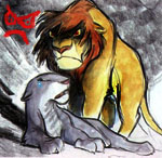
I'm so glad the cover artists have actually seen the movie! It's not half bad, compared to previous covers, except the original VHS cover. Anybody else dancing?

![]() by changa » November 13th, 2011, 7:01 am
by changa » November 13th, 2011, 7:01 am


![]() by DGFone » November 13th, 2011, 7:33 am
by DGFone » November 13th, 2011, 7:33 am


![]() by Regulus » November 13th, 2011, 7:43 am
by Regulus » November 13th, 2011, 7:43 am


![]() by aloobah » November 13th, 2011, 11:17 am
by aloobah » November 13th, 2011, 11:17 am


![]() by AdAstrα » November 13th, 2011, 12:54 pm
by AdAstrα » November 13th, 2011, 12:54 pm
![]() by BlazePrower9205 » November 13th, 2011, 4:12 pm
by BlazePrower9205 » November 13th, 2011, 4:12 pm

![]() by BlitzRogue » November 13th, 2011, 9:26 pm
by BlitzRogue » November 13th, 2011, 9:26 pm
![]() by Pocahontas » November 13th, 2011, 11:08 pm
by Pocahontas » November 13th, 2011, 11:08 pm
 I mean, I like the overall look of the high definition stuff, but Kovu looks a little off, same with Zira. Hey, most of the time it's just Disney Sequels that hit theaters that get such fancy covers, like Bambi 2 (It was in Theaters for me
  ) And Peter Pan 2.
![]() by TheLionPrince » November 14th, 2011, 11:33 pm
by TheLionPrince » November 14th, 2011, 11:33 pm
AdAstra wrote:Is it getting a separate Blu-ray release then? I thought it was just getting released on DVD?
I love the cover btw
![]() by VitaniOutsider » November 26th, 2011, 12:19 pm
by VitaniOutsider » November 26th, 2011, 12:19 pm


Users browsing this forum: No registered users and 18 guests